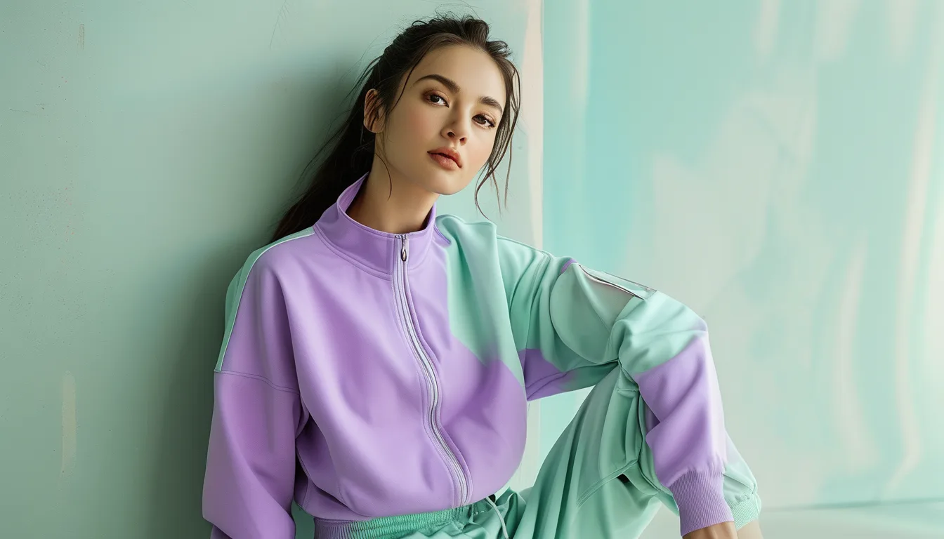
Why Pastel Activewear Never Looks the Same in Photos as It Does in the Mirror
Quick Answer: Pastels are low-saturation colours, which means they carry very little colour information for a camera or your eye to lock onto. Any shift in light source — daylight, gym fluorescents, warm home bulbs — pushes them further than a saturated colour would be pushed, because there is less original colour to overwhelm. Cameras compound this with automatic white balance, which corrects for the light and often removes the pastel’s tint along with it. This is physics, not a manufacturing fault.
You did not misremember the colour. Two of the three images are lying, and it is predictable which.
Here is why, and what to do if you actually want the colour to survive.
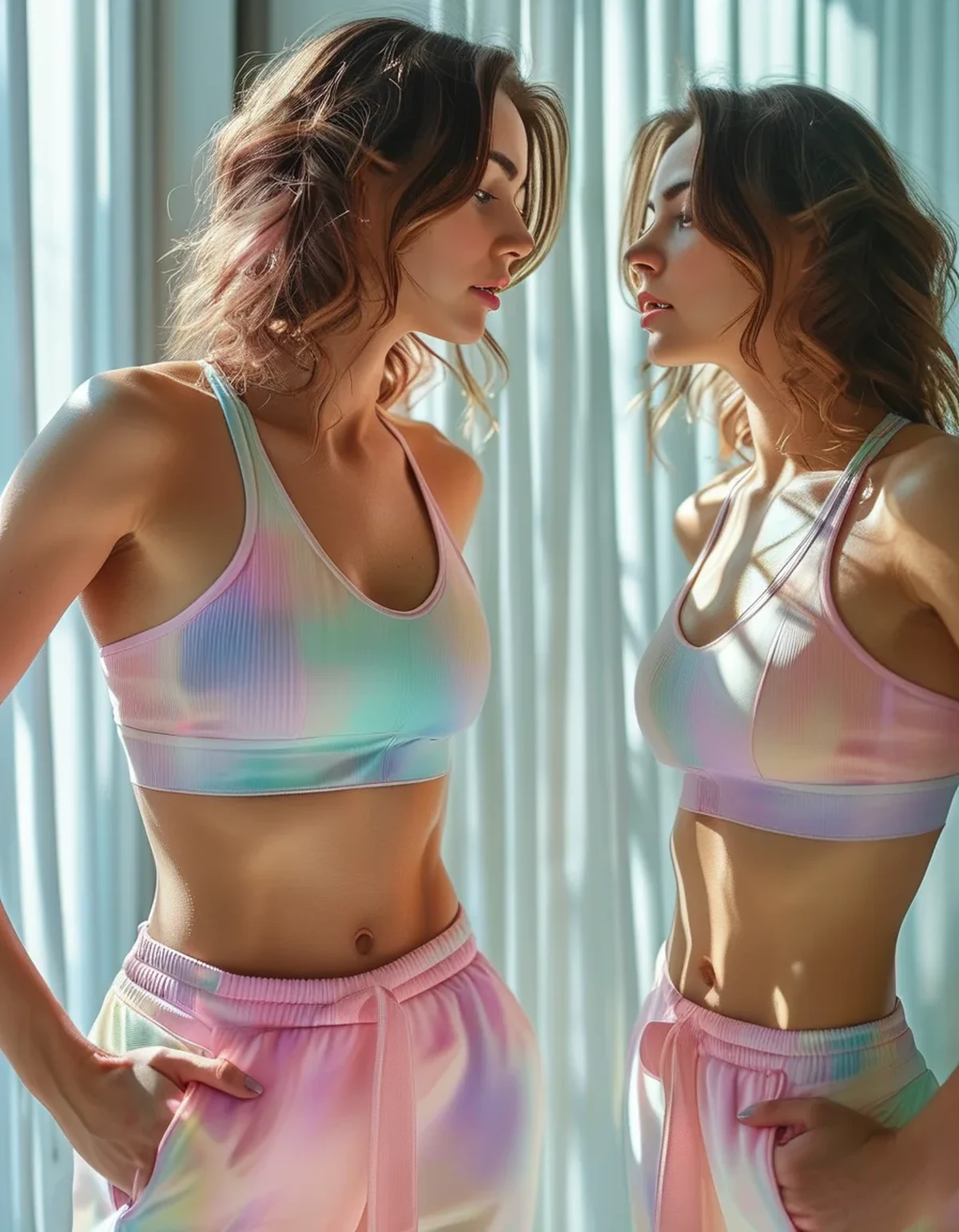
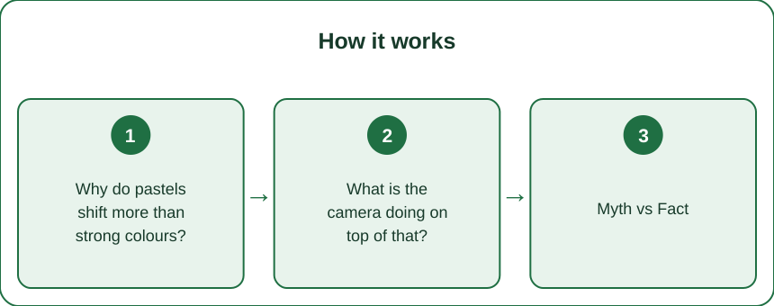
Why do pastels shift more than strong colours?
Because of what a pastel physically is.
A saturated colour reflects a narrow band of wavelengths strongly. A pastel reflects a broad range of wavelengths at fairly high brightness with only a slight bias toward one part of the spectrum. That slight bias is the colour.
So when the light source changes, the effect on a saturated colour is proportionally small — there is a lot of colour signal and the shift adjusts it. On a pastel, the shift can be as large as the original bias, which means the colour can move a long way or disappear entirely.
A practical illustration:
Under warm indoor bulbs (2700K), a cool pastel like sage, lilac or powder blue loses most of its identity. There is very little blue light available to reflect, so the fabric reflects mostly the warm light hitting it and reads as grey or beige.
Under gym fluorescents or cheap LEDs, the light often has spikes and gaps across the spectrum rather than being smooth. Colours that depend on the missing regions go flat. This is why gym mirrors are the worst place to judge any colour, and pastels especially.
In overcast daylight, light is diffuse and slightly cool, and most pastels look close to their true colour or very slightly cooler.
In direct sun, high brightness washes out low-saturation colour further, so pastels look paler outdoors than indoors.
Which pastels are most stable?
Warm-leaning ones — blush, buttermilk, warm sand. They hold together across more lighting conditions because most artificial light is warm-biased.
What is the camera doing on top of that?
Adding a second layer of change, and often a bigger one.
Automatic white balance is the main culprit. Your camera tries to work out what colour the light is and neutralise it, so that white objects look white. It does this by analysing the scene and shifting everything toward neutral.
On a pastel, this is a disaster. The camera cannot easily distinguish between a white garment under slightly green light and a slightly green garment under white light. It frequently guesses the first, and corrects your sage top into a grey one.
The more of the frame your pastel occupies, the worse it gets, because the camera uses the whole scene to decide.
Phone computational processing adds more. Modern phones apply saturation, contrast and tone-mapping automatically, and these are tuned to make typical photos look punchy. Low-saturation colours get pushed around by algorithms designed for something else entirely.
Skin-tone prioritisation is the third factor. Phone cameras optimise for faces, adjusting the whole image so skin looks right. If the lighting is warm, the correction applied to fix your skin also strips warmth from your clothing.
What to do if you want an accurate photo:
- Shoot in overcast daylight or open shade, which is the most neutral common lighting available.
- Include something genuinely white in the frame so the camera has a real reference.
- Lock the white balance manually if your camera app allows it.
- Avoid mixed lighting — window plus indoor bulb is the hardest case for any camera.
Myth vs Fact: pastel activewear
Myth: The colour looked different because the batch was different. Fact: Batch variation exists and is usually small. A colour that reads completely differently between two rooms is a lighting effect, not a dye lot.
Myth: More expensive pastels hold colour better in photos. Fact: Price affects dye quality and fade resistance over time. It does not change how a low-saturation colour behaves under a given light source, which is physics.
Myth: Screens are showing it wrong. Fact: True, and it is a smaller effect than the capture side. Two phones will show the same photo slightly differently, but the big change happened when the photo was taken.
Myth: Pastels are unflattering on camera. Fact: They are unpredictable on camera. In good light they photograph beautifully, precisely because they are soft and do not compete with skin tone.
Myth: A pastel that looks grey indoors is faded. Fact: Take it outside before concluding anything. Genuine fading shows up as uneven, worse at seams and stress points, and is visible in daylight.
Myth: White balance only matters for professionals. Fact: It is the single variable that decides whether your sage set photographs as sage. It matters more for pastels than for anything else in your wardrobe.
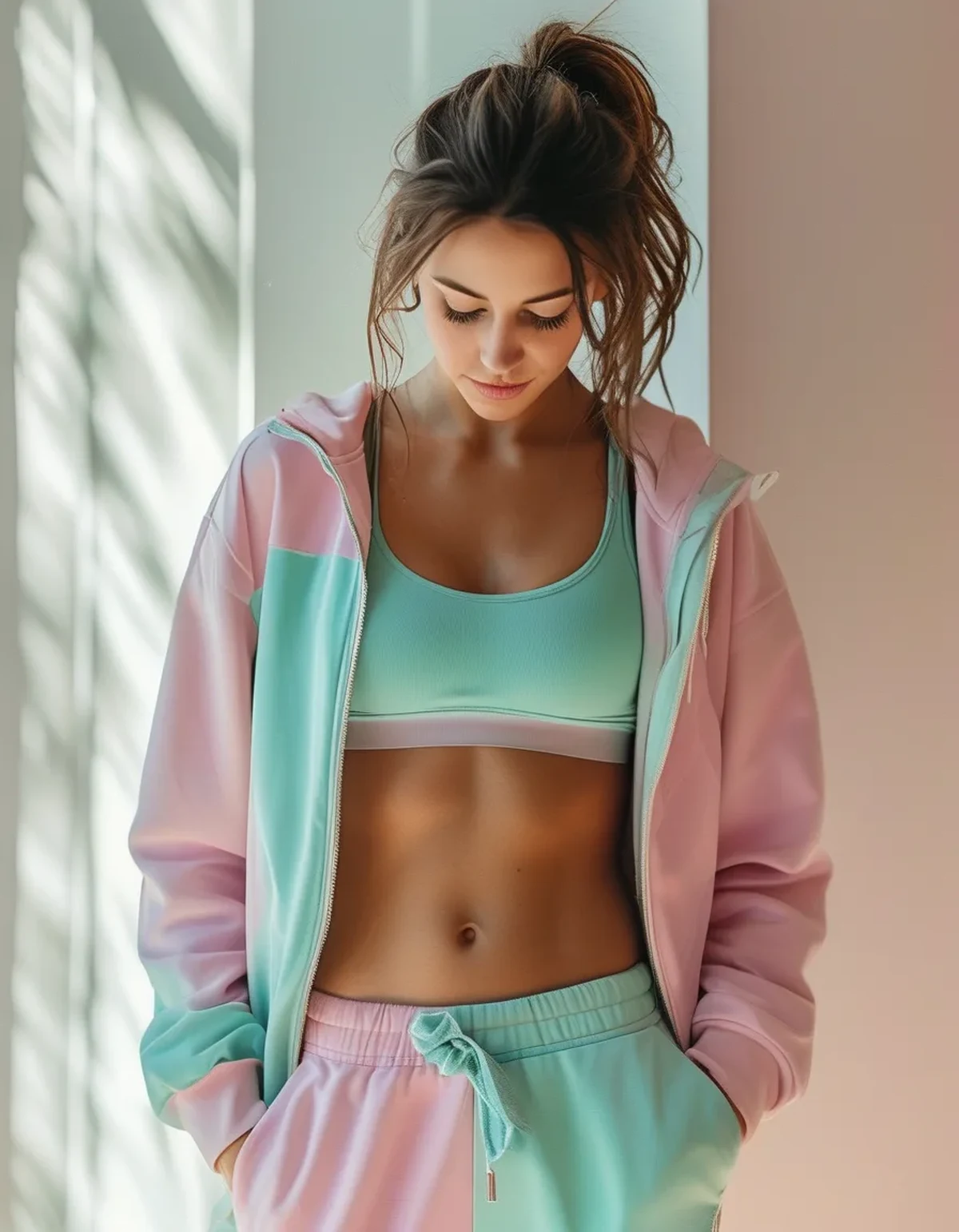
How do I choose pastels that will actually work for me?
There is a practical buying method, and it takes two minutes.
- Look at it in daylight before deciding. Shop lighting is designed to be flattering and is almost always warm. If you cannot get to a window, hold the item near the door.
- Check it against your skin in the same light. Pastels sit close in tone to many skin tones, and the ones that work are the ones with enough contrast against your skin to read as a separate colour.
- Consider where you will wear it. A set for outdoor running will be seen in daylight and will look like itself. A set for an indoor studio with warm lighting will look one or two shades duller than it does at home, permanently.
- Prefer pastels with a warm bias if you mostly train indoors — blush, sand, oat, warm clay. They survive artificial light far better than cool sage, lilac and powder blue.
- Buy the set together. Two pastels from different collections that look coordinated in one light can clash badly in another, because they shift by different amounts.
And one practical point specific to activewear: pastels show sweat far more than mid or dark tones, and the wet patch changes the colour dramatically because water changes how fabric reflects light. Thicker fabrics and textured knits hide this considerably better than smooth thin ones. It is worth checking the fabric weight rather than just the shade.
Does this affect what I should wear for photos at events?
If photos matter, choose a colour with more saturation, or check the venue lighting first. A pastel in a warm-lit room will photograph as a neutral, whatever you do.
Is there anything seasonal about this?
Yes, and the effect is intensifying right now for two reasons.
The sun is lower and the light is warmer. As the season turns, daylight itself shifts — the sun spends more of the day at a low angle, and low-angle sunlight passes through more atmosphere, which scatters out blue and leaves the light warmer. Cool pastels look progressively duller in natural light from late August onward, and this is not your imagination.
That golden light everyone loves in autumn photographs is the same light that turns sage grey and powder blue into nothing.
And you are spending more time under artificial light. Shorter days mean more indoor training, more indoor photos, and more of the warm-biased lighting that pastels handle worst.
Practical seasonal notes:
- Cool pastels are a spring and summer proposition in daylight terms. If you want soft colours through autumn, warm pastels hold up far better — clay, oat, dusty rose, buttermilk.
- This is genuinely why autumn palettes went warm long before anyone thought about it deliberately. The light selects for them.
- If you photograph your outfits, shift your shooting time. The neutral window is narrowing — midday overcast is now the most reliable light, where in June it was most of the day.
- Sweat marks show more indoors, so if you are moving training inside, fabric weight matters more than it did in July.
Should I stop wearing cool pastels in autumn?
Not at all — just know they will read as soft neutrals rather than as colours for the next several months, and buy them knowing that.
FAQ: Pastel Colour Questions, Answered
Why does my sage set look grey in every gym photo?
Gym lighting is usually cool fluorescent or cheap LED with gaps in the spectrum, and your camera’s white balance then corrects further. Both effects strip the same tint.
Is there a lighting setup that shows pastels accurately at home?
A north-facing window on an overcast day is the closest thing to a neutral reference most people have access to.
Do pastels genuinely fade faster?
They show fade more, which is different. The same amount of colour loss is far more visible on a low-saturation colour.
Which pastel is safest to buy online?
Warm neutrals — oat, sand, blush. They shift least across lighting conditions, so the photo you saw is closest to what arrives.
Why do two pastels that matched in the shop clash at home?
Because they shifted by different amounts under a different light source. Always check a pairing in daylight before committing.
TL;DR:
- Pastels carry very little colour signal, so any lighting change moves them proportionally further than a saturated colour.
- Warm indoor bulbs kill cool pastels — sage, lilac and powder blue read as grey or beige.
- Automatic white balance often removes the tint entirely, mistaking a coloured garment for a white one under coloured light.
- Gym mirrors are the worst place to judge colour thanks to spiky fluorescent and LED spectra.
- Judge in overcast daylight, include something white in photos, and lock white balance if you can.
- Warm pastels survive artificial light; cool pastels are a daylight proposition.
- Autumn light is warmer and lower — cool pastels will read duller every week from here.
The colour is fine. The light keeps changing the question.
Keep Reading
This article is for general informational and styling purposes only. Fit, sizing, and product availability may vary.