Why Pastel Activewear Looks Different Under Gym Lights Than Daylight
Quick Answer: Colours look different under different light sources because the light itself contains different amounts of each wavelength, and a fabric can only reflect what is present. Pastels are hit hardest because they are pale, low-saturation colours where a small shift is a large proportion of the total colour. Gym and studio lighting is often high in green or blue output, which is why a pale pink can read grey and a mint can read clinical. Two garments that match in daylight can visibly clash under artificial light, an effect called metamerism, and it is a property of the dye rather than a fault.
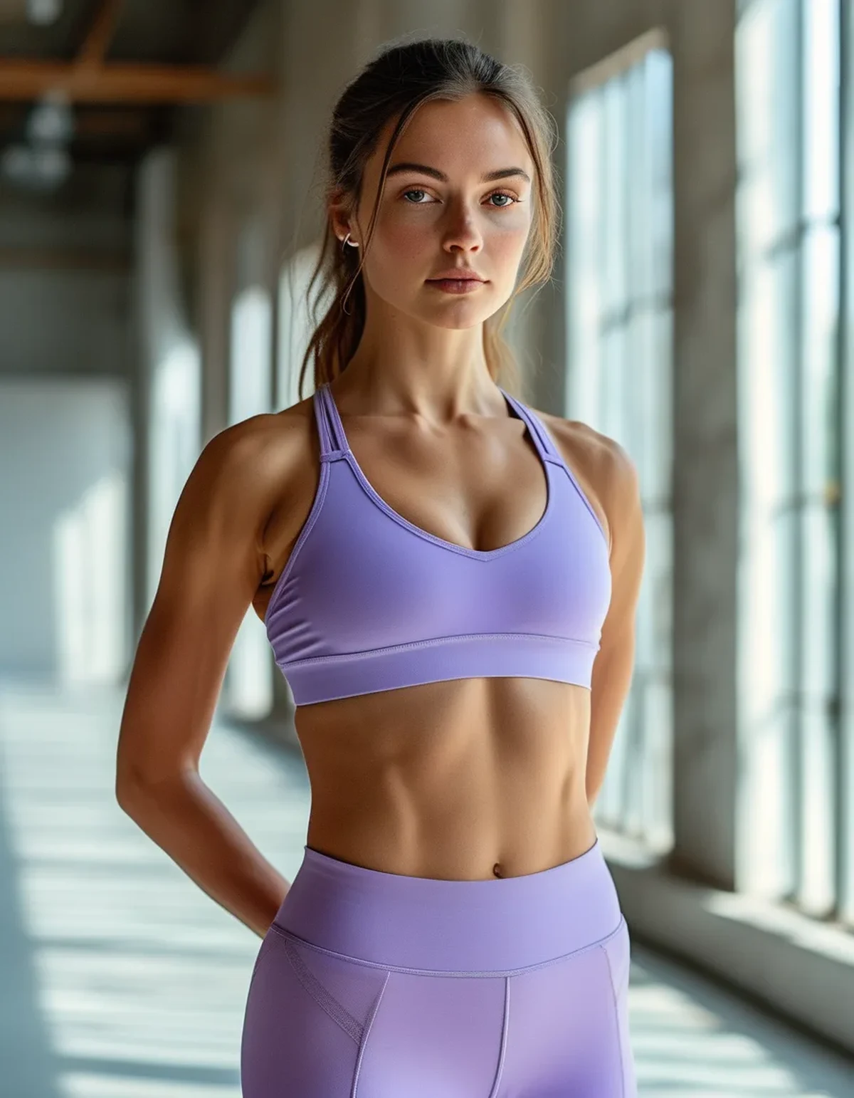
You bought the set because that specific soft lilac looked beautiful in the shop window and better in your bedroom.
You walk into the studio, catch yourself in the mirror, and it has gone slightly grey and slightly sad. Nothing about the fabric changed in the eleven minutes since you left the house.
Why does the same colour look different under different lights?
Because colour is not a property of the object alone. It is what happens when a light source, a surface, and your eye interact.
A light source does not contain all wavelengths equally. Daylight is relatively balanced across the visible spectrum. An LED panel produces a spiky distribution with much more output in some bands than others. Older fluorescent tubes are notoriously spiky, with strong peaks and large gaps.
A fabric can only reflect what it is given. If a dye’s colour depends on reflecting a wavelength band that the light source barely produces, that component of the colour effectively disappears. A pale pink that relies on a warm red component will look grey under a light source with almost no red output.
Colour rendering index describes this, imperfectly. CRI is a measure of how faithfully a light source renders colours compared to a reference. Retail environments often use high-CRI lighting deliberately, while gyms and studios frequently do not, because the priority there is brightness and efficiency. This is exactly why the changing room and the studio floor disagree.
Pastels are the most vulnerable category. A saturated red has a lot of colour to lose before it stops reading as red. A pale blush is only a small distance from grey to begin with, so a modest shift moves it across a category boundary. The same shift that makes a saturated colour look slightly off makes a pastel look like a different colour entirely.
Skin tone is in the picture too. The light is also changing how your skin reads, and colour is always judged in context. A pastel that flatters in warm daylight can look draining under cool light partly because your complexion has shifted, not the garment.
What is metamerism and why do my two pastel pieces stop matching?
It is the single most frustrating version of this problem and it is not a manufacturing defect in the usual sense.
The definition. Two colours are metameric when they appear identical under one light source and different under another. This happens because the two surfaces achieve the same apparent colour through different reflectance curves, and once the light changes, the curves no longer produce the same result.
Why it happens in activewear specifically. A set often combines different fabrics: a smooth compression legging and a ribbed or double-lined bra, sometimes different fibre blends, dyed in separate batches with different dye recipes chosen to hit the same target under a standard light. Under the store’s lighting they match. Under yours they do not.
It is more common with pastels for the same reason as above. Small absolute differences are large proportional differences at low saturation.
What you can do about it:
- Check a set under at least two light sources before deciding, ideally daylight through a window and the store’s overhead lighting. Stepping to the shop door is enough.
- Buy pieces of a set together and from the same batch where possible, since batch variation compounds the effect.
- Prefer sets made from a single fabric throughout when the colour matters to you. Mixed-texture sets in pastel are the highest-risk combination.
What you cannot do about it. There is no washing, care, or treatment that fixes metamerism. It is a property of the dyes. Anyone telling you a wash will bring two mismatched pastels back together is describing a different problem.
Which pastels hold up and which ones collapse?
There is a fairly consistent ranking, and it maps to how far each colour sits from grey.
Most robust under mixed lighting:
- Pale blue and periwinkle. Most artificial lighting is relatively rich in the blue end, so blues tend to hold or even intensify. They rarely read as dingy.
- Pale sage and true mint. Green is well represented in most LED output, so these stay recognisably themselves, though they can read colder.
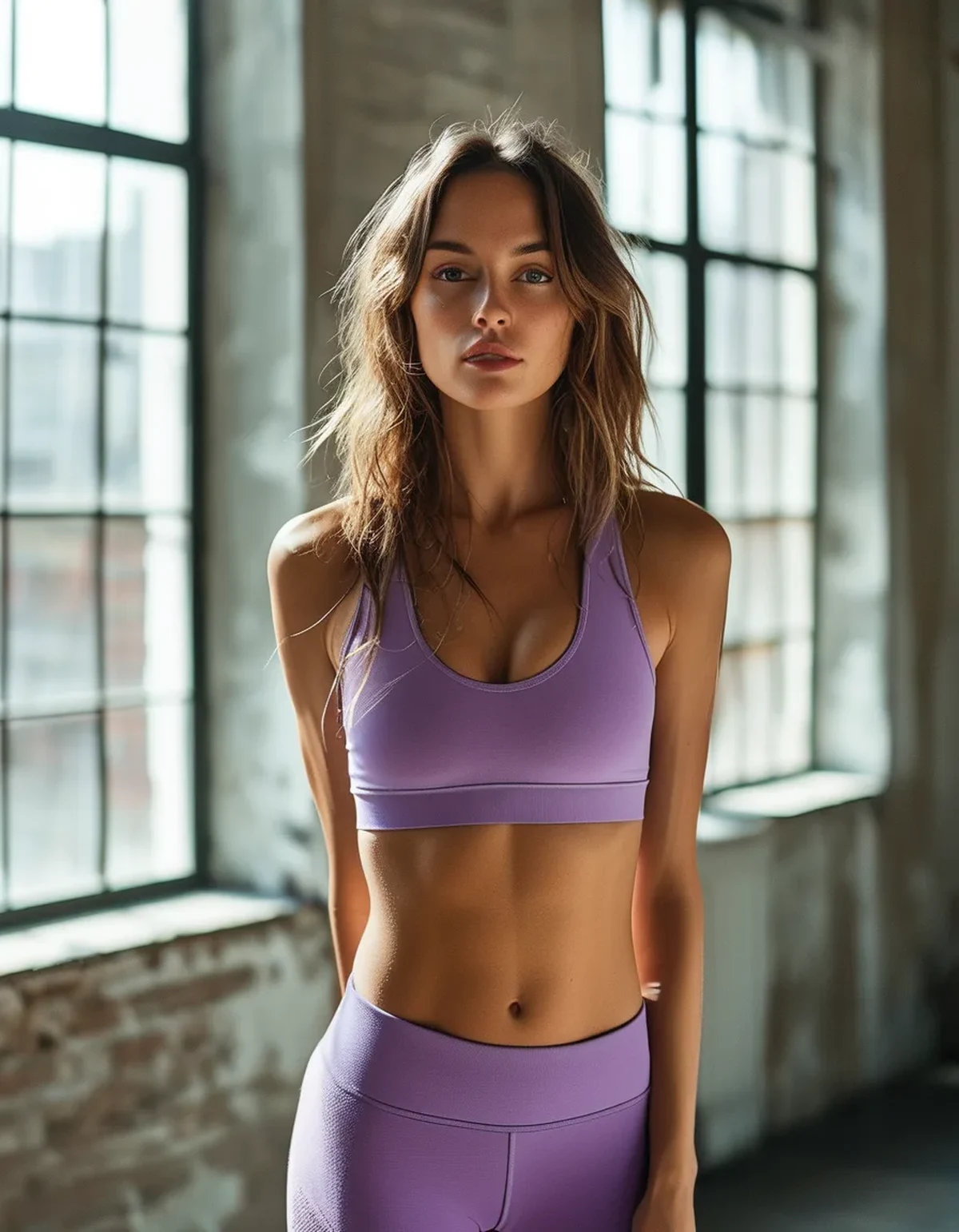
- Lavender and lilac. Reasonably stable, with a tendency to shift slightly blue or slightly grey depending on the source.
Least robust:
- Blush, peach, and pale coral. These depend on a warm red component that many efficient light sources under-produce. They are the classic go-grey pastels.
- Butter yellow and pale cream. Vulnerable in the other direction, since they sit close to white and can read as slightly dirty white under cool light.
- Pale grey-pinks and mushroom tones. By definition close to neutral, so they can read as any of several colours depending on the room.
Fabric structure changes it too. A matte, textured surface scatters light in many directions and produces a more consistent read across environments. A smooth, high-lustre compression fabric produces specular highlights that pick up the colour of the light source directly, which is why shiny pastels shift more visibly than matte ones.
And this compounds with the sweat problem. As this blog has covered, wet fabric looks darker, and mid-tone pastels have the largest gap between wet and dry appearance. Under unflattering light, a slightly damp pastel is being hit by two effects at once.
What Nobody Tells You About Pastels and Lighting
Mirror position matters more than the bulbs. Most studio mirrors are lit from directly overhead, which throws shadows downward and drains colour from vertical surfaces. The same room, viewed with light coming from the side or from a window, renders the same garment noticeably better. If a colour looks wrong in one mirror and fine in another in the same building, this is why.
Phone cameras lie in a specific direction. Automatic white balance tries to correct the colour cast, so a photo often shows a truer colour than your eye does, or overcorrects and makes a pastel look more saturated than it is. Photos taken in a gym mirror are a poor guide to how a colour actually reads to other people in the room.
Screens are why online pastel shopping fails so often. Your monitor or phone renders a pastel with its own colour profile and brightness, and the product photo was shot under studio lighting and then edited. Of all colour categories, pale low-saturation shades are the ones least likely to arrive looking like the picture.
Yellowing is a separate issue and is often mistaken for a lighting effect. If a pastel looks dingy in every light rather than only in some, that is residue and antiperspirant buildup rather than colour rendering, and this blog has covered the fix.
Warm-lit studios have the opposite problem. Boutique studios that deliberately use warm, low lighting flatter blush and peach considerably and can make cool mints and pale blues look muddy. There is no lighting that flatters every pastel, which is worth knowing before deciding a colour is wrong.
Seasonal note: as daylight shortens and gets lower and warmer through autumn, the daylight reference itself shifts. A pastel that read perfectly in flat summer light will read differently in October afternoon light, and neither is the fabric changing.
FAQ: Pastel Activewear and Colour, Answered
Why does my pastel activewear look grey at the gym?
Because many efficient light sources produce little output in the warm red band that pale pinks and blush tones depend on. The fabric can only reflect what the light contains, and pastels sit close enough to grey that a small shift crosses the line.
Why do my matching pastel top and leggings not match anymore?
Most likely metamerism. The two pieces are different fabrics dyed to match under one reference light, and under a different light source they diverge. It is a dye property, not a wash or care problem, and nothing will fix it.
Which pastels are safest to buy?
Pale blues, periwinkle, sage, and true mint hold their character across most lighting. Blush, peach, and pale coral are the most likely to read grey. Matte and textured fabrics stay more consistent than shiny ones.
TL;DR:
- A colour can only reflect the wavelengths present in the light, and gym lighting is often missing what pastels depend on.
- Pastels shift most because a small absolute change is a large proportional change at low saturation.
- Two pieces that match in the shop can genuinely stop matching elsewhere. That is metamerism, and no care routine fixes it.
- Blues, sage, and mint travel well. Blush, peach, and pale coral are the ones that go grey.
Check any pastel set under two light sources before you commit. Walking to the shop door is enough.
See It in Motion
Seen here: Super High Waist Embossed Yoga Leggings with Inner Pocket — shop it on bubblelime.com
Keep Reading
This article is for general informational and styling purposes only. Fit, sizing, and product availability may vary.